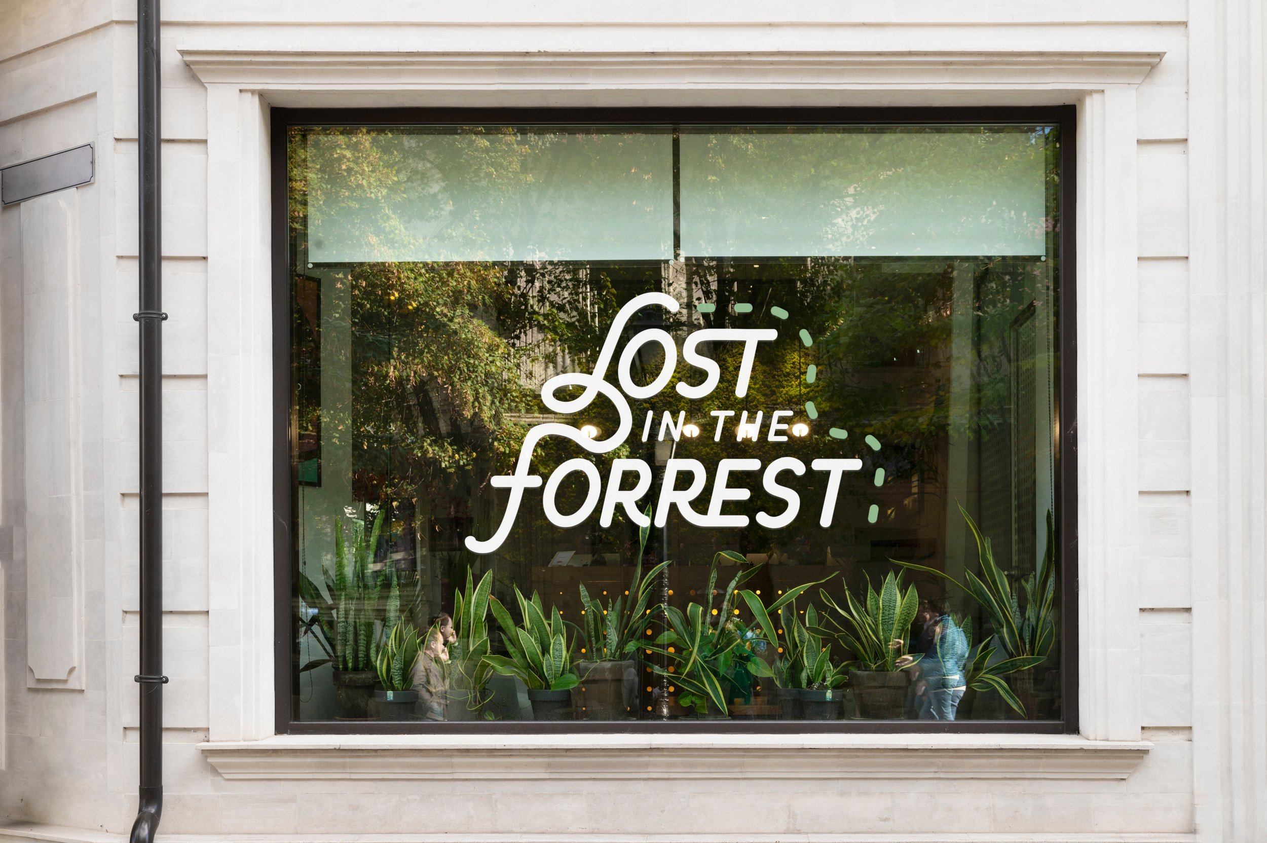
"Lost in the Forrest" is a plant shop situated in Minneapolis, Minnesota, owned by a woman named Forrest.
In the course of their expansion, they sought a distinctive and memorable logo to enhance overall branding.
With the business name being "Lost in the Forrest," the aim was to create a visual representation that captures the essence of being lost in a forest. The team was open to our creative vision while desiring a logo that could contribute to a more cohesive brand identity.
LOST IN THE FORREST

OUR CONCEPT
In conceptualizing a concept that plays off the business name "Lost in the Forrest," we envisioned incorporating flowy directional dotted lines reminiscent of those found on a treasure map.
To ensure consistency across the logo, we integrated these map-like, flowing lines into the font design, particularly emphasizing the connections within the "LF." The separation of this "LF" then became the focal point of the icon.
We are delighted with the outcome of the logo and how it all flows together. Pun intended!

“We are beyond grateful for Nicole and her team. They created a holistic branding package and made it very easy for us to use from day to day. This agency makes the overwhelming task of rebranding a fun and exciting process!
- The Lost in the Forrest Team


